Designing patient-centered mental health experiences.
Enhancing patient-centered mental health care through personalized treatment, collaborative support and innovative strategies to improve outcomes for people of all ages.
Patients struggled to book appointments, reach their providers and find their medical information online.
What I did
Led the research and redesign: surveys, personas, journey map, a new information architecture, wireframes and WCAG-compliant hi-fi.
The result
Patient engagement up 25% and administrative workload down 15%, with better appointment completion.
Project overview
The challenge
Tandem is a psychiatric practice that helps people navigate mental health challenges such as addiction, anxiety, depression, bipolar disorder, ADHD and childhood mental health issues. Despite exceptional care, patients and caregivers were struggling with the digital tools available to them. Scheduling appointments, communicating with providers and reaching critical medical information were far from seamless. That meant frustration, missed appointments and a disjointed experience for caregivers and clinicians alike.
As Tandem’s UX Designer and Researcher, I was tasked with making this experience more accessible, efficient and empowering for patients and providers: streamlining scheduling, improving communication and making medical records easy to reach, while making the practice run more smoothly.
Project overview
The problem
Patients had trouble reaching their providers, managing appointments and finding important medical information.
Many missed appointments, got lost in a complex website, or couldn’t quickly message their doctors.
What patients told us
Limited direct communication – with providers.
Difficulty reaching medical information.
Website accessibility barriers.
Appointment management issues.
Project overview
The solution
Streamline scheduling, strengthen provider communication and improve accessibility for a more seamless, patient-centered experience.
Direct communication with providers
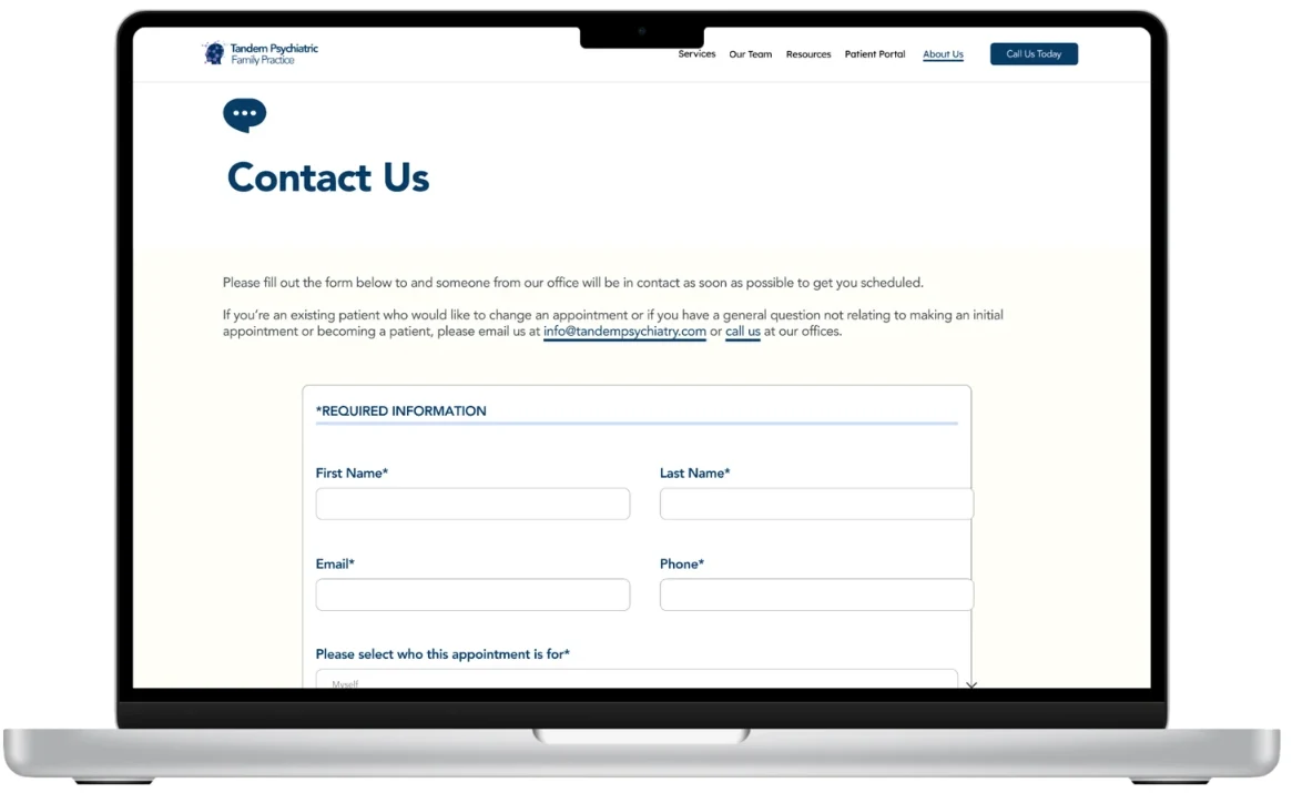
A secure “Contact Us” message page where patients can write to their doctor directly, improving communication and response times.
Appointment management & self-service
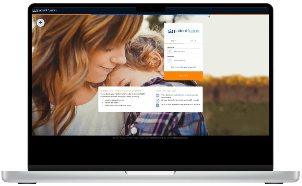
The practice’s existing patient service site brought into the main navigation, reducing admin work and patient confusion.
A more accessible website
A refined information architecture and wireframes that improve navigation and the overall experience.
My impact
Integrating direct messaging and simplifying navigation led to a 25% increase in engagement, and optimized scheduling workflows reduced administrative burden by 15%. Research-driven design made the platform more seamless, efficient and inclusive for patients and providers.
Project overview
Design process
I followed a structured UX process to keep the work user-centered and research-driven while aligning with business goals.
Empathize
User research
To begin, I ran UX research to understand the challenges patients faced:
User surveys: with patients about their day-to-day needs and frustrations with existing tools.
Stakeholder workshops: with the internal team, to align product goals with user needs.
The survey covered 20 patients, gathering qualitative insight into their digital experience and pain points.
85%were frustrated by the lack of direct communication with providers
75%found appointment scheduling confusing and hard to navigate
60%struggled to find lab results and other critical health information
40%had trouble using the website because of poor navigation and accessibility
“I wish I could just send my doctor a quick message instead of waiting for a call back.”
“It’s frustrating that I have to go through multiple steps just to see my lab results.”
“The website is confusing, and I can’t find the information I need.”
“I missed my last appointment because I forgot the time, and I can’t find an easy way to check my next one.”
Define
User personas
The research pointed to two core personas:
Justin Carter
24 · Graphic Designer
Justin was recently diagnosed with bipolar disorder and is working to establish a consistent care routine. As a freelancer, his schedule is unpredictable, and he often forgets appointments. He wants a mobile-friendly platform where he can quickly check availability, reschedule when needed and reach his provider easily. He prefers messaging over phone calls, so messaging his doctor directly is essential.
Goals
Get appointment reminders and see provider availability instantly
Use an easy-to-navigate, mobile-optimized interface
Communicate by message instead of phone calls
Get to his medical information securely and quickly on the go
Challenges
Forgets appointments and needs reminders
Needs mobile access to schedule changes and provider messaging
Finds phone calls inconvenient and prefers texting or online messaging
Needs lab results without clicking through multiple pages
Sarah Thompson
45 · High School Teacher
Sarah has been managing anxiety for several years while also caring for her teenage son, who has ADHD. She schedules appointments for both of them, and finds it frustrating to manage multiple appointments, find lab results and reach providers. She wants a simple, intuitive platform where she can check availability, message doctors and stay on top of her family’s mental health care.
Goals
Book and manage appointments for herself and her son in one place
See her family’s lab results and visit notes without digging
Message providers directly instead of making repeat phone calls
Use a calm, clearly organized platform she can trust
Challenges
Juggles two people’s appointments across separate schedules and calls
Can’t find lab results and records quickly when she needs them
Spends time on hold or waiting for call-backs to reach a provider
Gets overwhelmed by cluttered navigation, which adds stress when she’s already anxious
User journey map
I mapped the current patient journey to find where the system was failing and where there was room to improve.
Stage
User goal
User actions
Emotions
Pain points
Opportunities
Awareness
Learn about Tandem and find mental health care
Searches online, asks for referrals, visits the website
Confused, unsure of next steps
Website lacks clear navigation and provider info
Improve site structure, add a “Find a Provider” page
Onboarding
Set up an account and understand services
Creates an account, tries to explore options
Frustrated by unclear steps
Complicated forms, login issues
Simplify onboarding with guided tutorials
Appointment booking
Schedule a visit with minimal effort
Tries to book online or calls the office
Stressed, annoyed
Hard-to-use scheduling, no reminders
One-click scheduling, automated confirmations
Pre-visit preparation
Prepare and complete forms
Fills out intake forms, reviews provider details
Anxious about missing paperwork
No digital intake, unclear instructions
Mobile-friendly digital forms, automated reminders
Consultation
Meet the provider and discuss concerns
Attends the session, takes notes, asks questions
Relieved but forgets key info
No easy way to track session notes
Post-visit summary in the patient portal
Post-visit follow-up
Review the summary and next steps
Looks for instructions, tries to message the provider
Confused, uncertain about next steps
Hard to find visit notes, delayed responses
Secure messaging, visit summaries
Ongoing engagement
Stay connected and manage care
Sends messages, checks the portal for updates
Confident in ongoing care
No real-time support, unclear medication reminders
Chat support, automated medication reminders
Ideate
Concept development
I led brainstorming sessions with the cross-functional team to turn the pain points into solutions:
Redesign the website – to improve navigation and accessibility.
Full accessibility compliance – following WCAG guidelines.
Bring the patient portal into the main navigation, so lab results, scheduling and provider messaging are in one central place.
These ideas became the foundation of our design and development strategy, keeping the solutions user-centered and aligned with business goals.
Affinity mapping
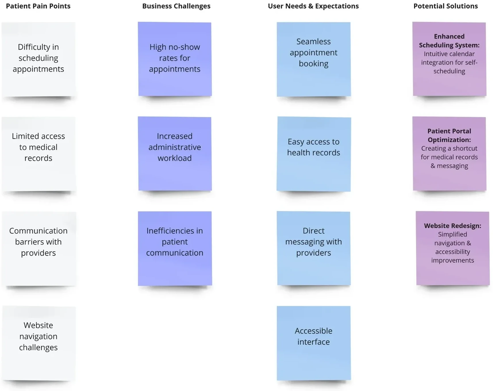
The affinity map organized insights from patient feedback, stakeholder interviews and research into pain points, business challenges and opportunities, revealing the patterns behind our design decisions.
Business challenges: high no-show rates, a heavy administrative workload and inefficient patient communication.
User needs: seamless booking, easy access to health records, direct messaging with providers and an accessible interface.
Key insights
Quick, easy interactions
Patients value quick, easy interactions with their providers.
Less friction for everyone
Reducing administrative friction benefits patients and staff.
Accessibility drives engagement
Improving accessibility can raise patient engagement.
Information architecture
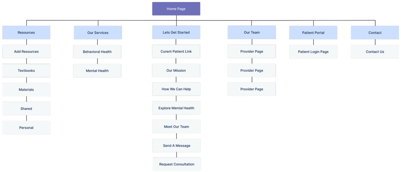
I restructured Tandem’s information architecture to improve navigation, accessibility and usability for patients and providers. A simpler structure, with scheduling, messaging and medical records easy to find and a clear flow, raised engagement and reduced administrative friction.
Design
Wireframe
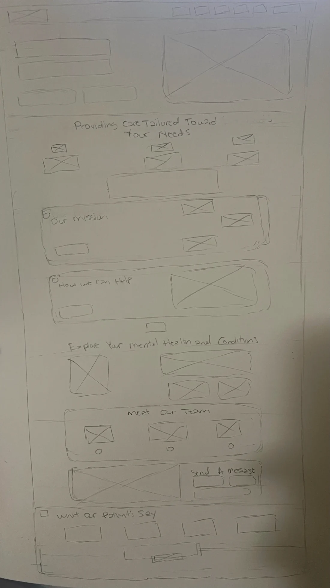
I sketched the home page on paper, then built interactive mockups in Figma to bring the concepts to life.
The sketch sets the order of the page: the hero, care tailored to your needs, our mission, how we can help, exploring your mental health, meet our team, send a message, and what our patients say.
Design
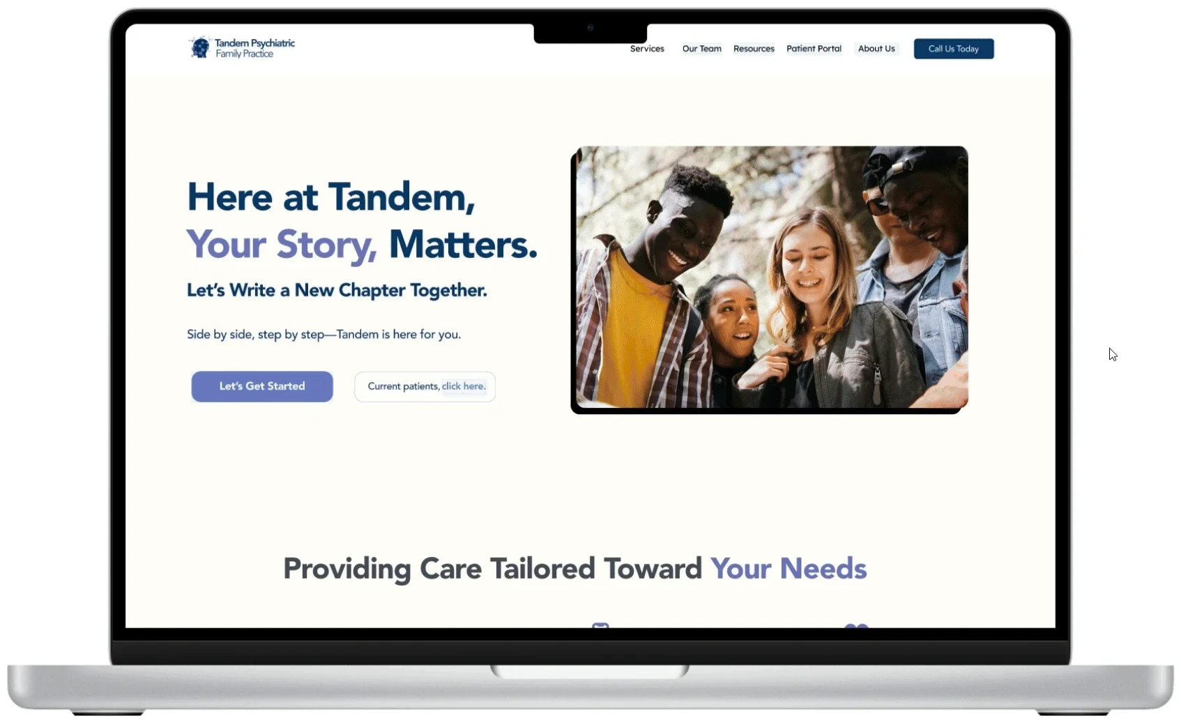
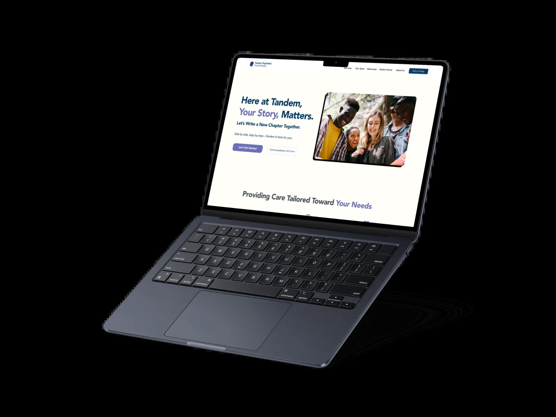
High-fidelity mockups
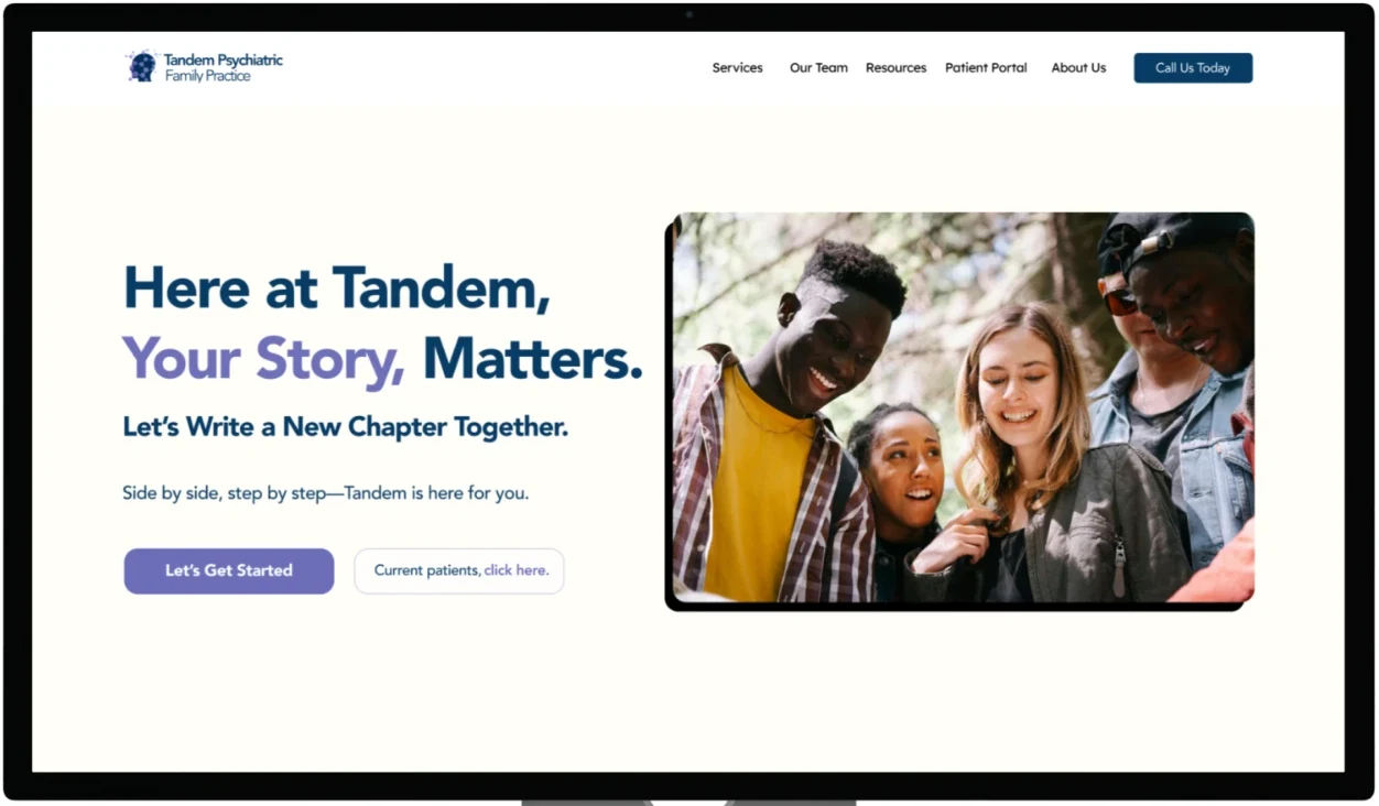
High-fidelity prototypes with detailed UI and accessibility features, including adjustable font sizes, color contrast adjustments and screen reader compatibility.
Making the website more accessible
Refined the information architecture, improving navigation and usability.
WCAG compliance, so the site is inclusive and easy to use for every patient.
Appointment management & self-service
Patient Fusion in the navigation – for easy access to medical records and messaging.
One place – to check lab results, schedule appointments and contact providers.
Simpler booking, reducing confusion and administrative workload.
Direct communication with providers
A direct contact phone number – to improve accessibility.
A secure “Contact Us” messaging page – for seamless patient–provider communication.
Reflect
Results & next steps
The redesign met key business goals: patient engagement up 25%, administrative workload down 15%, and appointment completion rates significantly improved.
Next, post-launch feedback will be essential to refining the platform and catching new pain points:
Personalized patient dashboards.
Streamlined appointment management.
Ongoing accessibility and usability improvements.
By tracking engagement and iterating on real needs, Tandem can keep delivering measurable impact in digital mental healthcare.